How might we...
simplify the decision making process for trip planning?
streamline the communication process?
Insight
It can be difficult to find something that meets everyone’s preferences and some people don’t respond as often
Insight
People don’t communicate or they lose interest too easily
Insight
It’s hard to get everyone on the same page most of the time.
Insight
People don’t respond fast, some people have potential conflicts so it takes a while to get those sorted out.
How might we...
gather everyone’s preferences for
trip activities?
include everyone in the trip
planning process?
Insight
It's difficult to get everyone on board for the same things sometimes. And budget is also very hard to control.
Insight
it can be difficult to get people to commit and to find activities that everyone planning to go will enjoy.
Insight
Can be difficult to make sure that everyone is interested in going.
Insight
Ppl got different priorities/interest as well as some ppl don’t got any license so they gonna be a passenger princess
Insight
I think the hardest thing about group trips is getting everyone’s equal participation in planning it. Without everyone sharing their input, it’s hard to decide on activities that will satisfy everyone without feeling like I’m planning the trip all by myself.
Insight
Usually involves a lot of back and forth, especially if it’s a bigger group. Finding things that we’ll all like doing is often difficult. Tracking and splitting expenses had been a hassle without spreadsheets. But I use wanderlog now to make the itinerary and track expenses.
How might we...
split costs efficiently amongst different activities?
How might we...
coordinate everybody’s schedules efficiently?
Insight
people are usually pretty down to go on group trips, the process of planning it just gets a little tedious when it comes to who is driving, how the costs are going to be split, a possible itinerary for the day, etc. personally i think would be nice for a trip planning app to take into account all the expenses of a trip and split an itemized bill evenly among all trip-goers to streamline the process; maybe this could include hypothetical in-app integration with airlines, uber, airbnb, restaurants, etc !
Insight
I feel as though I’m one of the main people planning trips out. It’s not exactly an issue but the main issues really come down to cost, transportation, and timing.
Insight
most difficult part is organizing rides, sending out deposits, and sending reminders for other payments (gas, airbnb, etc.), and making sure everyone is on the same page. itinerary is the easier part!
Insight
Only Finding time and scheduling is hard.
Insight
Difficult to find a time when everyone is free
Insight
Sometimes coordinating group trips can be difficult trying to accommodate everyone's different schedules or the different types of activities/food that everyone wants to try.




Understanding the problem space of “vacationing” and “trip planning”
Identify gaps in research to inform the next steps in user research
Understand the current knowledge of users about travel planning
User Research Goals
Identify what platforms students are currently using to plan trips.
Understand the current user journey of trip planning and post-trip logistics.
Identify potential pain points of the current trip planning process.
1
2
3
How might we...
create a mobile application that streamlines the communication of trip plans, engages all trip attendees in decision making, and simplifies the trip planning process?
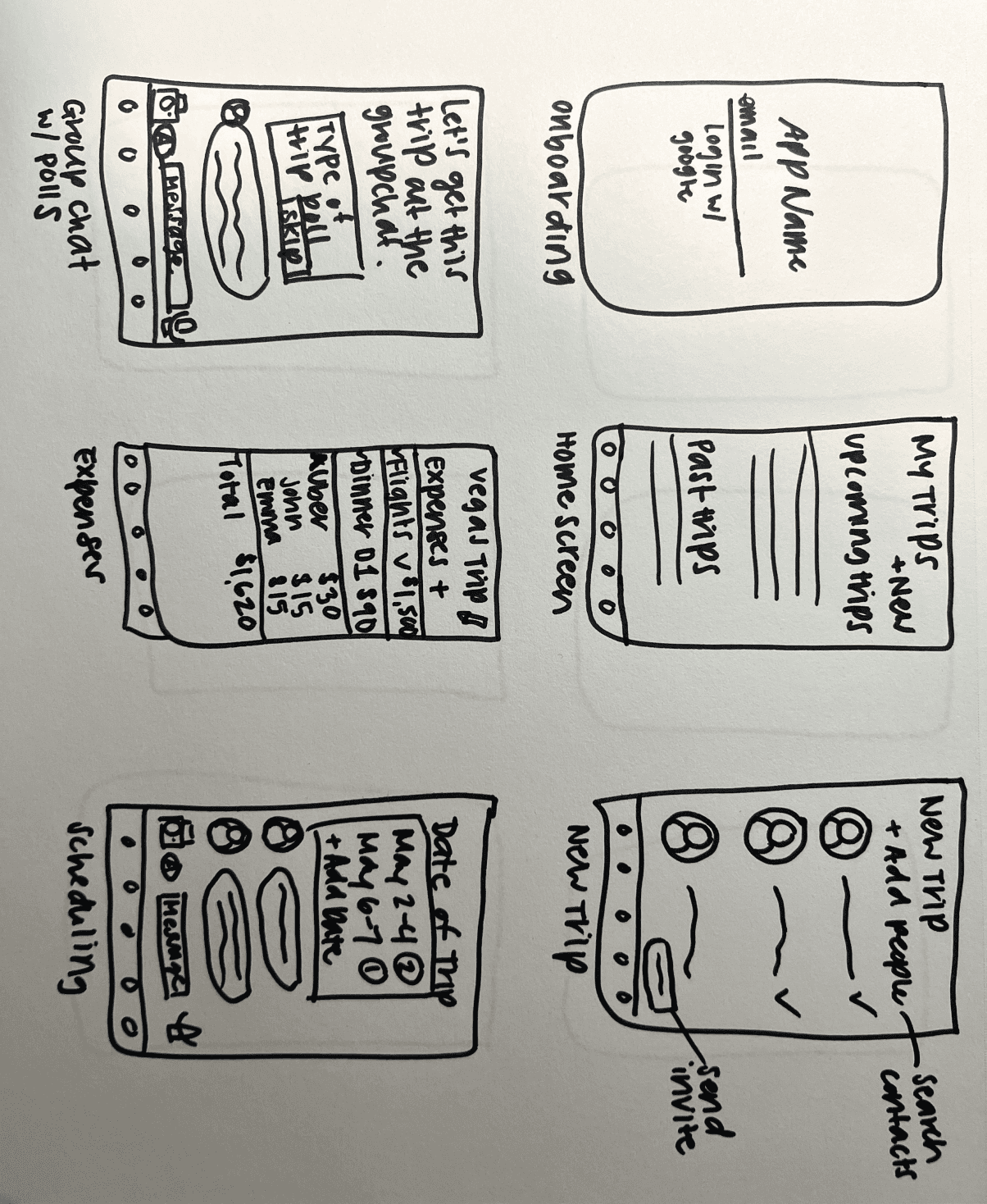
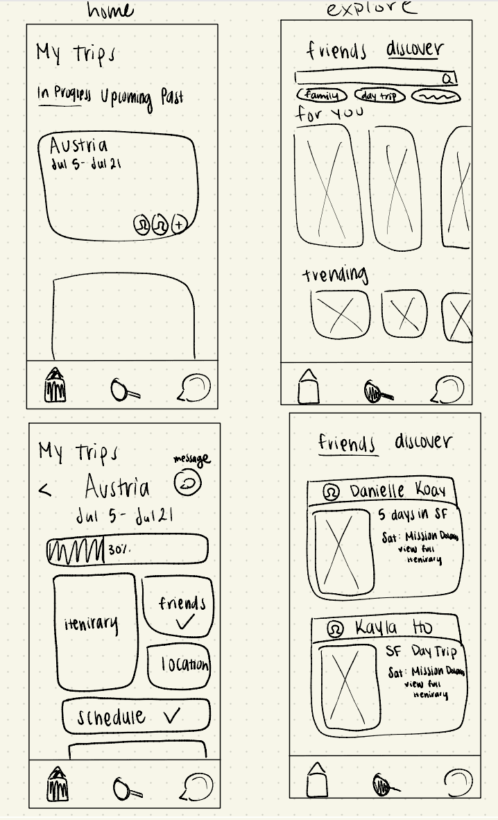
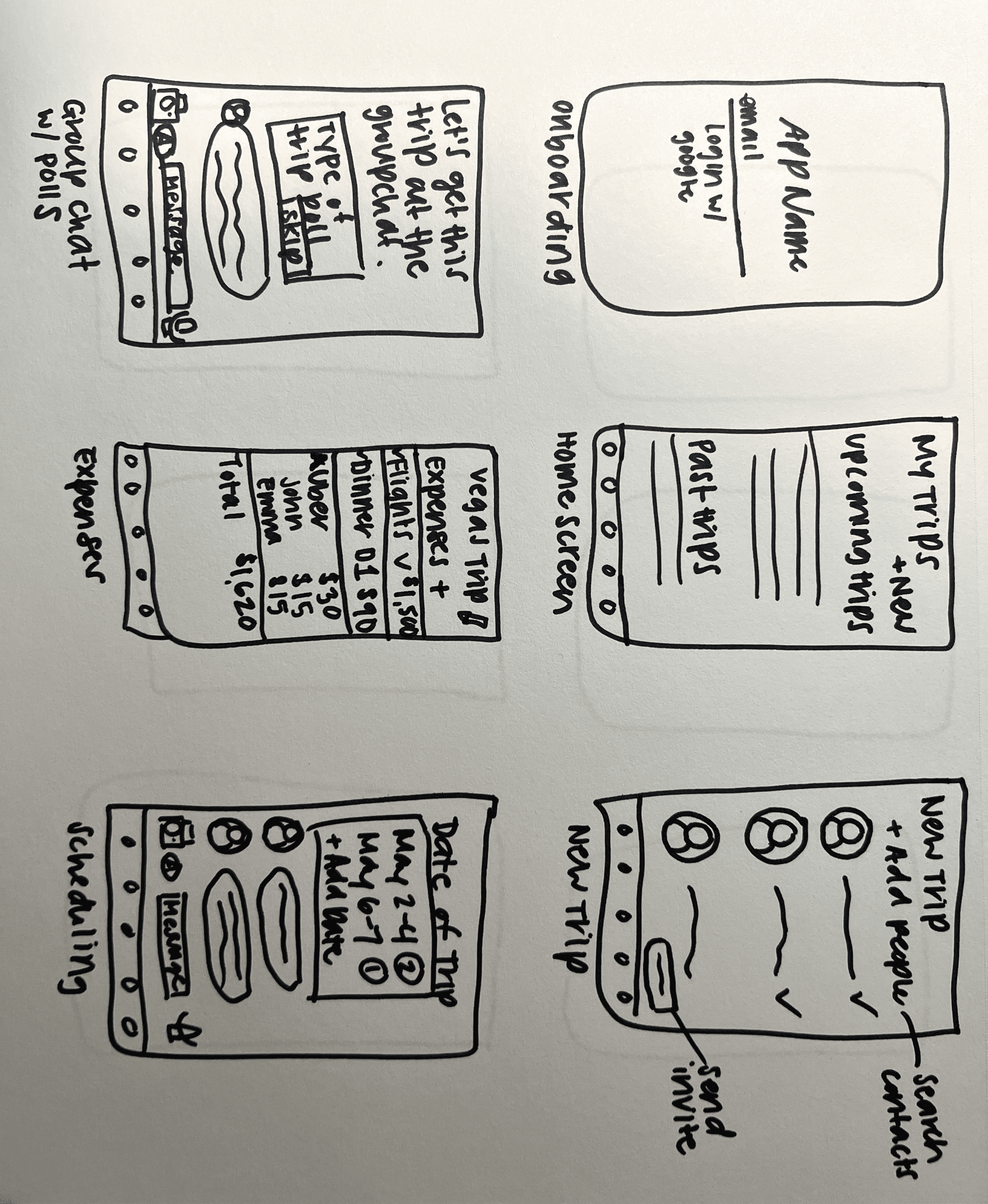
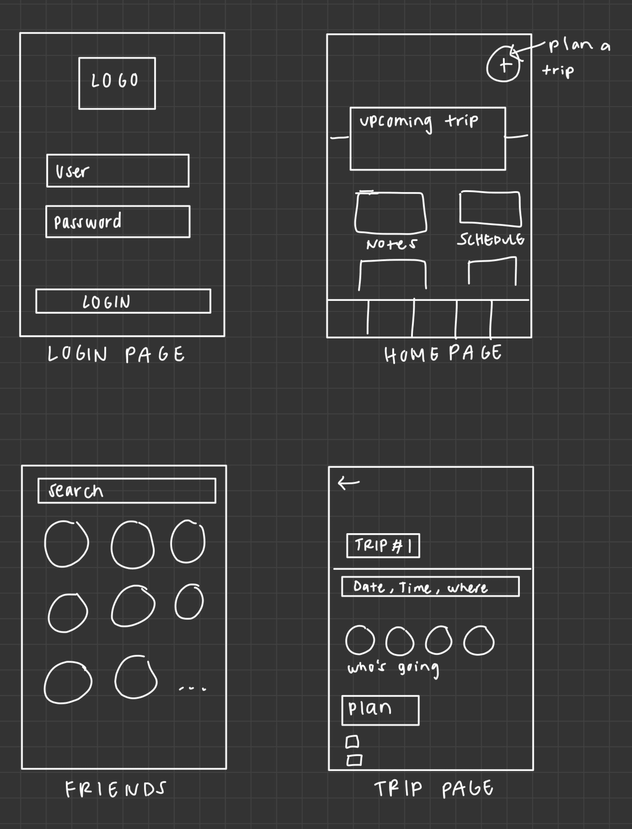
Moving into Figma
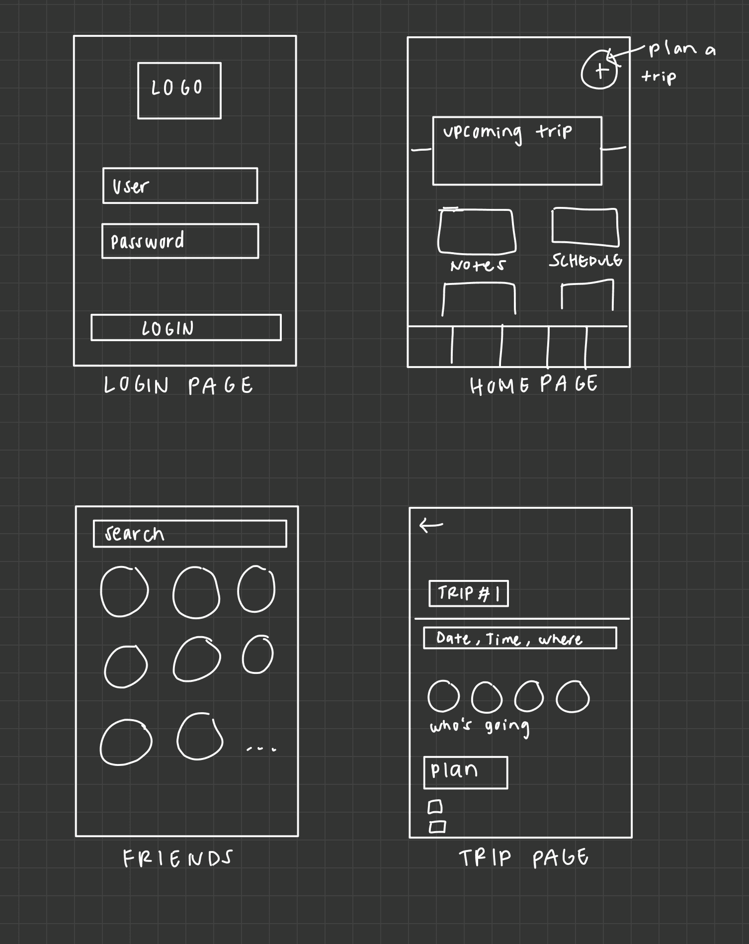
Round 1
Mid fidelity & User Testing
Round 2
High fidelity designs
Design Standards
We integrated a play on words with traveling to a “planet” and “plan it”. This prompted our galaxy
color palette and overall theme.
Normal
Bold
Inter
PlanIT
#272626
Background
#84DBDD
Brand 1
#A5ABEC
Brand 2
#F7BFC5
Brand 3
#3C3939
Accent
#F5F1EA
Text
LOGO
TYPOGRAPHY
COLORS

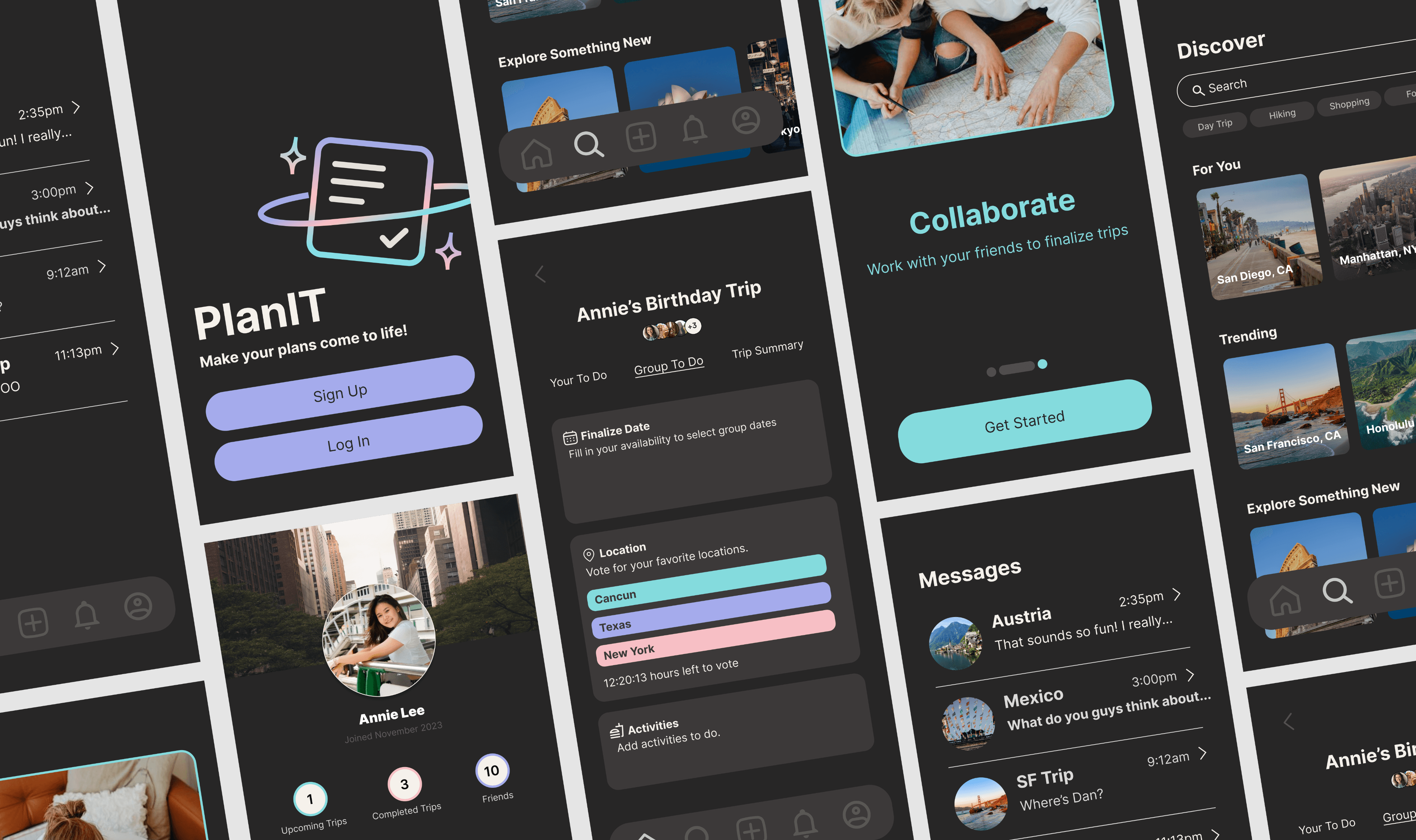
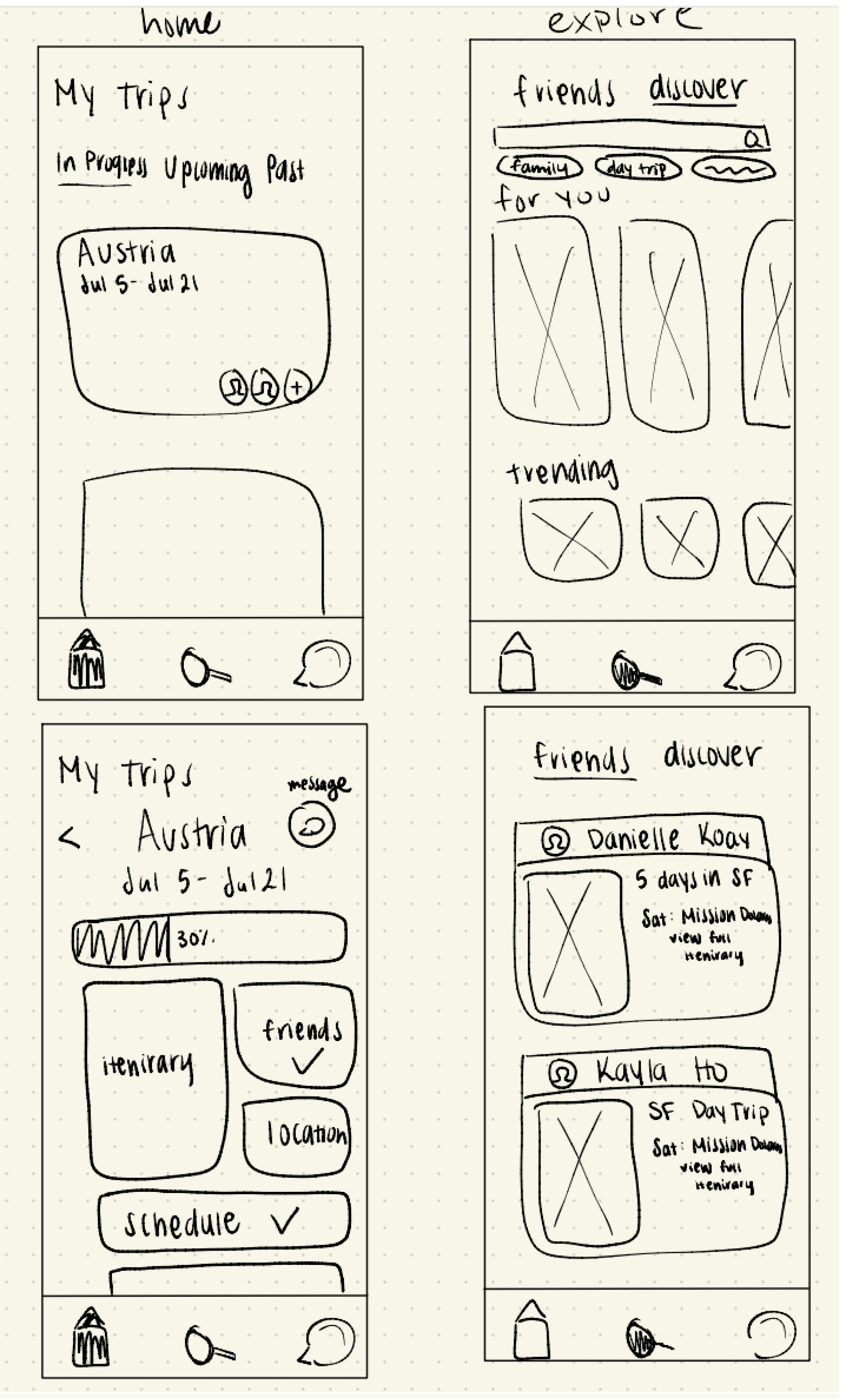
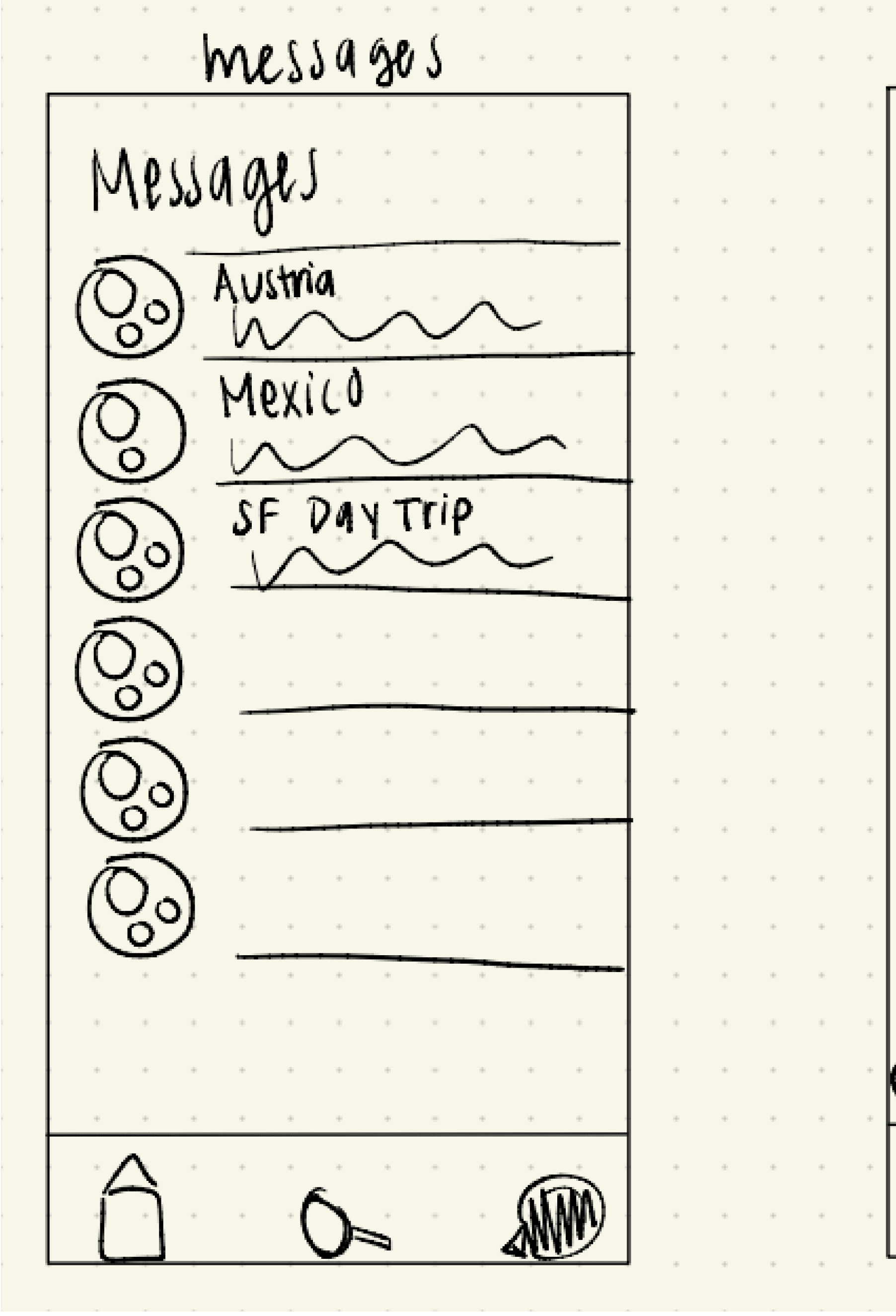
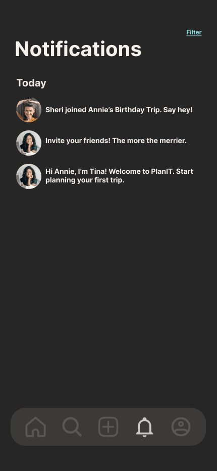
Replaced messaging tab with notifications --> moved messaging to a button in home page
Messaging is faster and easier for the user to access
Notifications tab guides the user throughout the app and encourages user to interact with more features
Notifications

Summarizes trip, making official information easily accessible for all parties
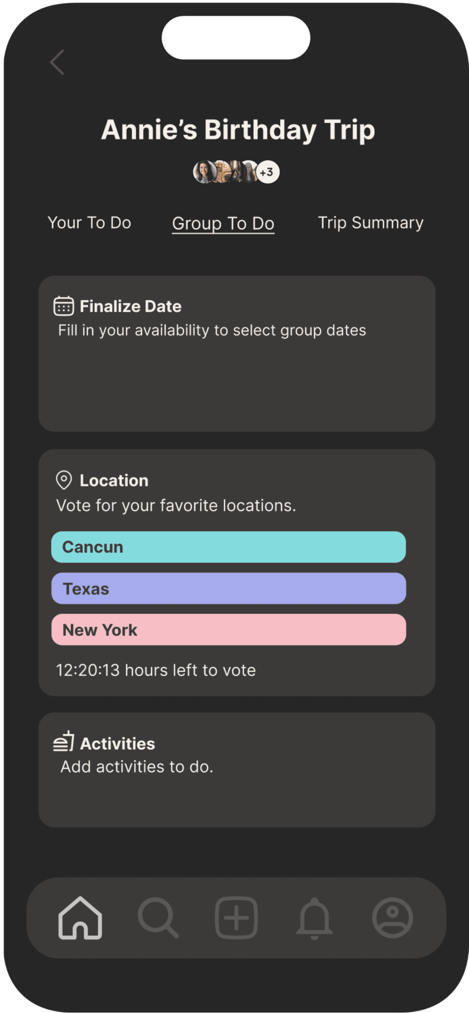
“Group to do” and “Trip Summary” tab switched, making “Trip Summary” furthest right --> makes distinction between categories more intuitive
Make a Trip

Downsized from 3 to 2 tabs in order to highlight the most important information: personal itineraries and saved itineraries.
Past itineraries are displayed on profile, while future trips are displayed on Home Page
Allows for more intuitive organization
Itineraries can be displayed publicly or privately to others
Profile Page

Clarified the difference between filters and categories
Serves for an overall less confusing navigation experience
Filters are displayed in search bar when applied, while categories are displayed in large headings
Discover
How to do a case study
As this was my first full length UX design project, I definitely got a better grasp of fundamental skills and the overall organizational process.
Collaborating with designers
I was able to work with designers of various levels of experiences and specialities. Learning to cater towards our strengths and goals definitely benefited the team.



You'll also like...
HackDavis
Design marketing material to promote the event and enhance the hackathon experience.
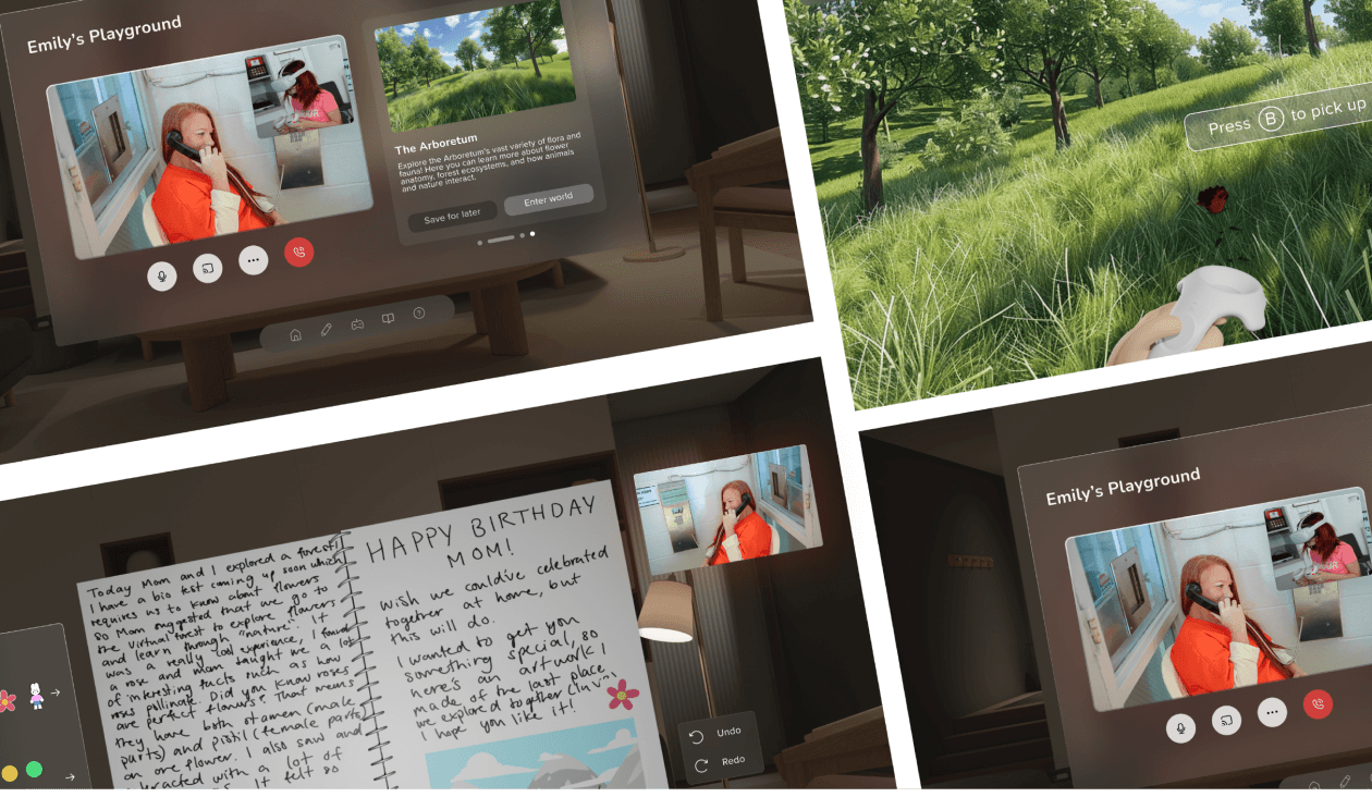
Playground
AR interface to provide educational opportunities, an outlet of creativity and a source of connection between children of incarcerated parents and their parents
Understanding the
problem space
Literature review
Competitive Analysis
User survey
User interviews
3
4
2
1
Trip Planning App
Oct-Dec 2023
The challenge
Develop a mobile application that enables users to effortlessly plan memorable trips.
The award
Awarded Most Innovative UX

Describes the overarching features of the app, rather than letting users go in blind
Introduces and eases users into the app, leading to a smoother and less
confusing experience
Onboarding
The mission
Our mission is to help users launch their plans for
out-of-this-world trips.
PlanIT
Role
UI/UX Designer
Duration
3 months
Tools
Figma and FigJam
Team
4 UI/UX Designers


PlanIT
Launch your plans into reality.
Findings
Key Insights

42% of Gen Z cite TikTok as a place to learn most about travel destinations
Global travelers plan to take more short getaways (≤3 nights) than longer vacations (>3 nights) in the next
12 months
Overnight trips have increased by 7% and day trips have increased by 20%


Overnight and day trips seem to be gaining more popularity
Marketing for certain places causes curiosity and excitement (people see New York on TikTok, they want to go there next)
Seeing what’s out there
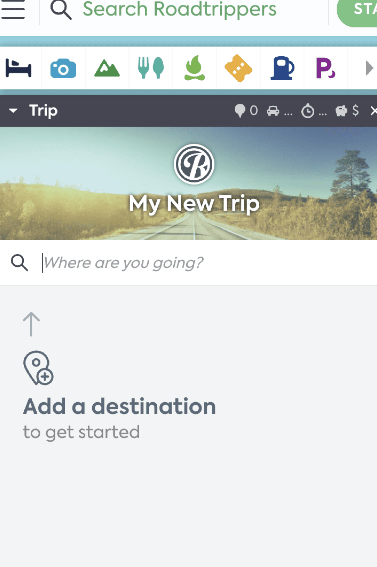
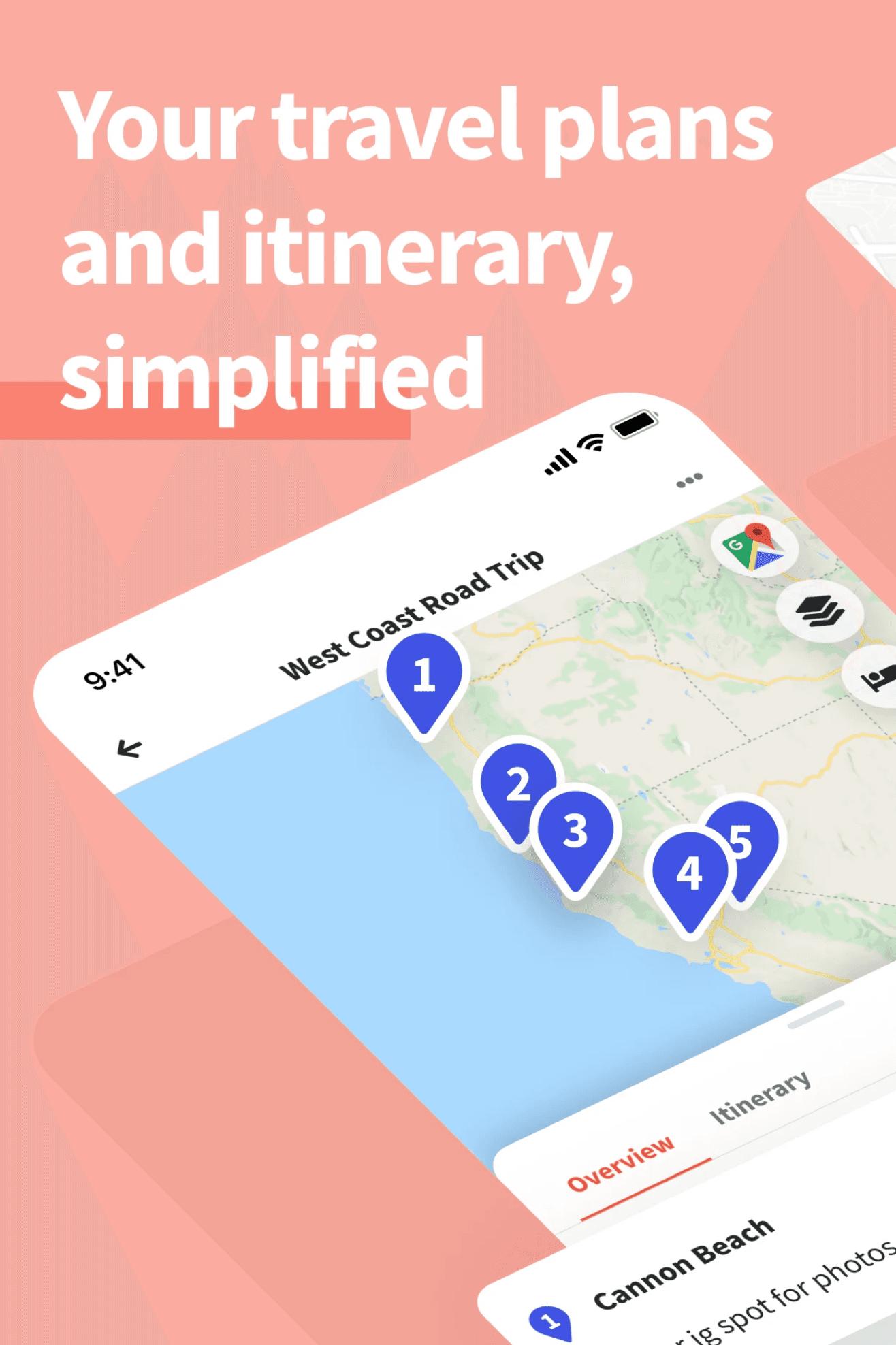


Road Trip Planner
Wanderlog
Expedia
Surveys
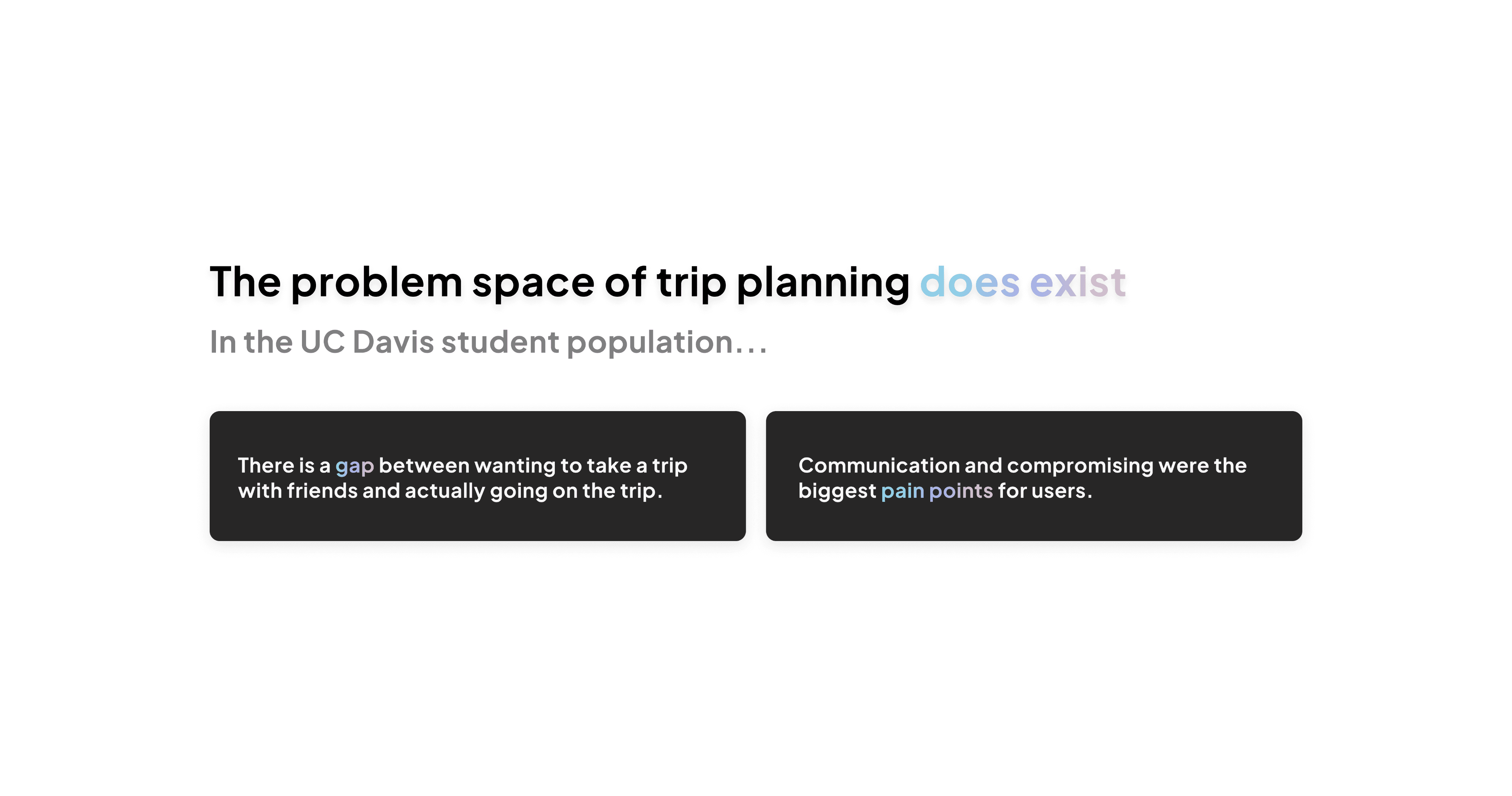
63%
26%
of students are highly interested in going on trips with friends
say their plans make it out of the
group chat
Interviews

“Sometimes it’s hard to get everyone to find common ground when deciding on activities”
“Usually one person does the planning and delegate tasks”
“[Currently uses] iMessage or a texting platform” to plan trips


Communication
Finding Activities
Scheduling
Splitting Costs
It is difficult to get everyone on the same page and there can be a lot of confusion regarding trip details.
Expenses add up from all parts of the trip and can get quite confusing, and easily lost in the group chat.
It is difficult to find a time that works for everyone’s busy schedules, especially in larger group settings.
Oftentimes, 1–2 people end up planning the entire trip. With a lack of participation in trip planning, not everyone is as ecstatic for
the trip.
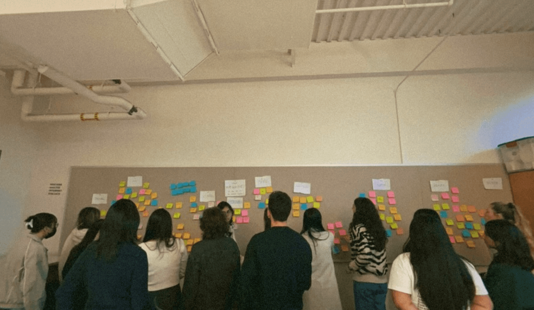
Synthesizing Pain Points
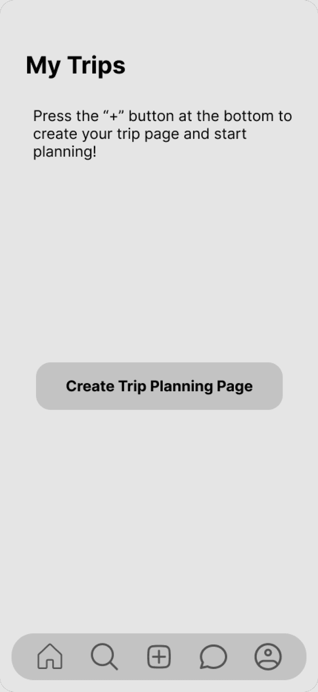

Onboarding
Didn’t understand the purpose of pop up frames

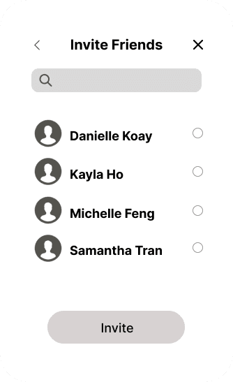
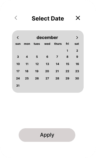
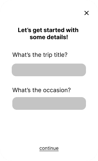
Intimidated by having to make concrete decisions so quickly
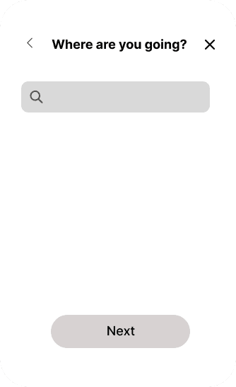
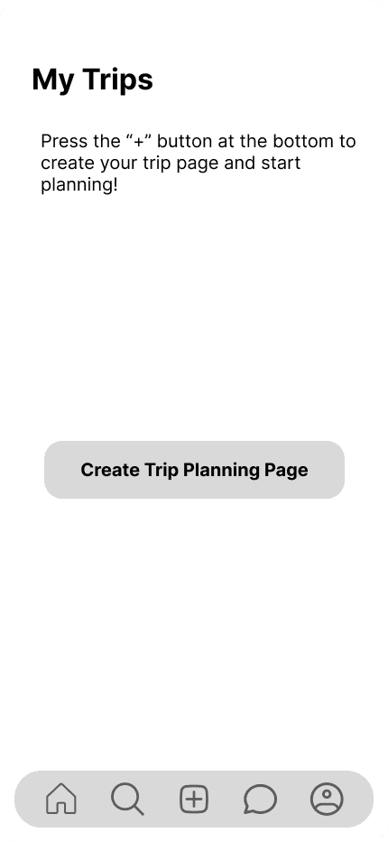
Planning a Trip

Enjoyed the columns to separate tasks
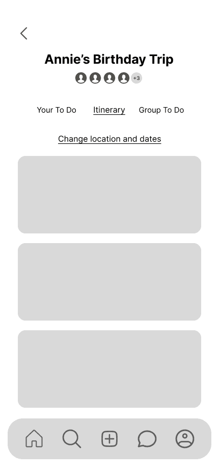
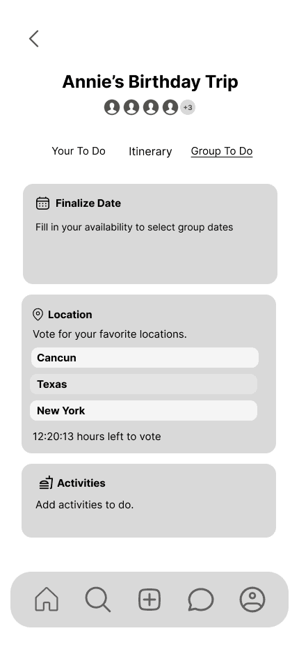
Confused with the itinerary page
Unclear on knowing when the trip is fully finalized
Past, Current, Upcoming
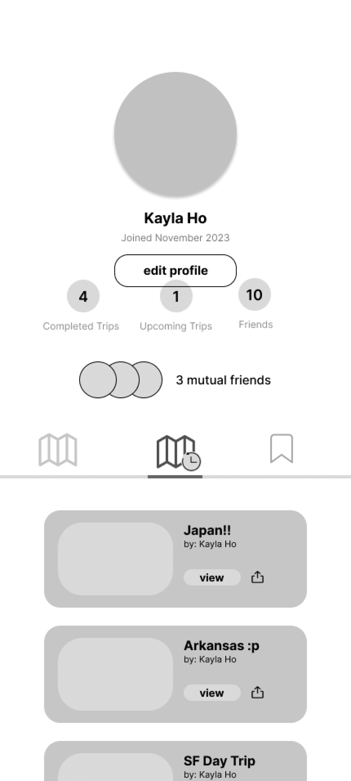
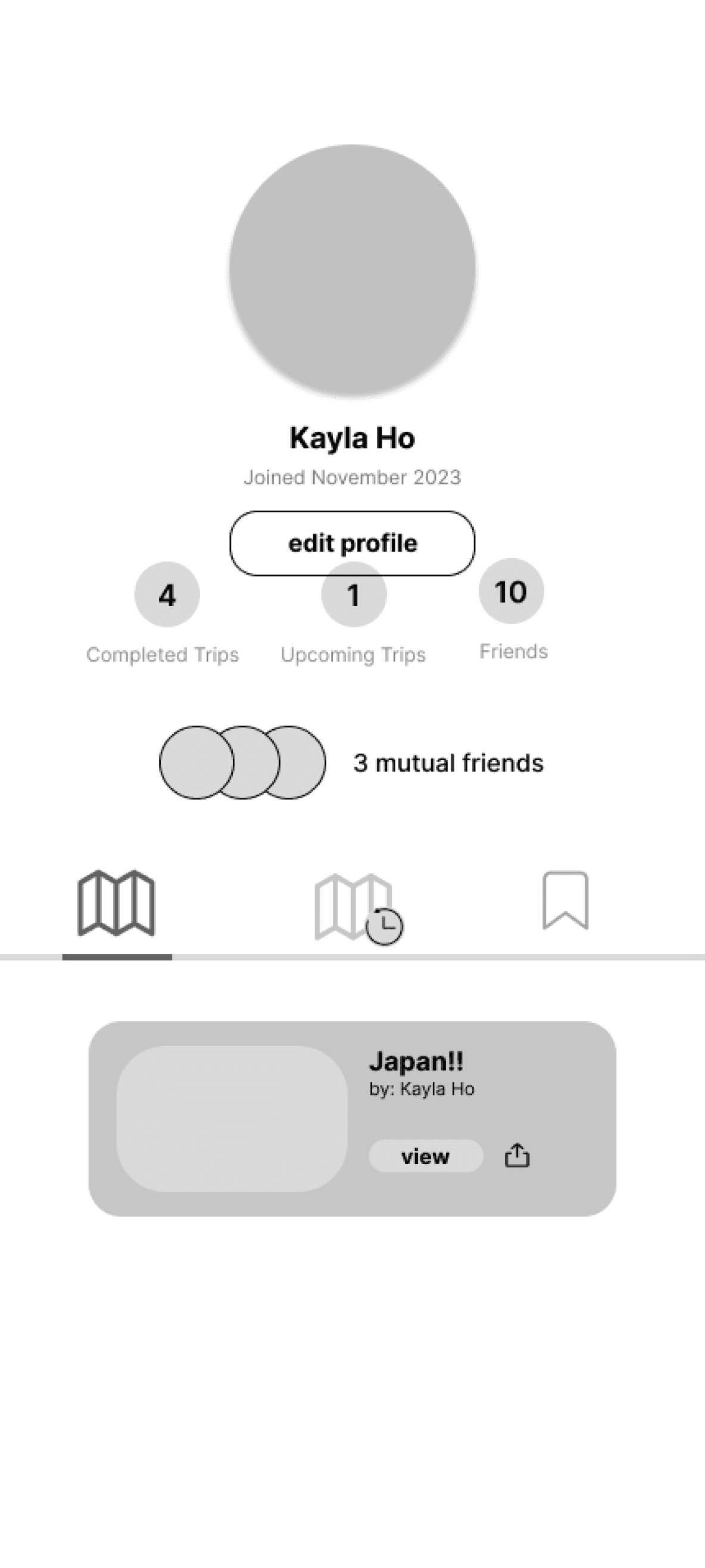

Enjoyed seeing current trips on the home page
Mixed up the difference between the two map icons
Thought the layout could be more concise
Discover
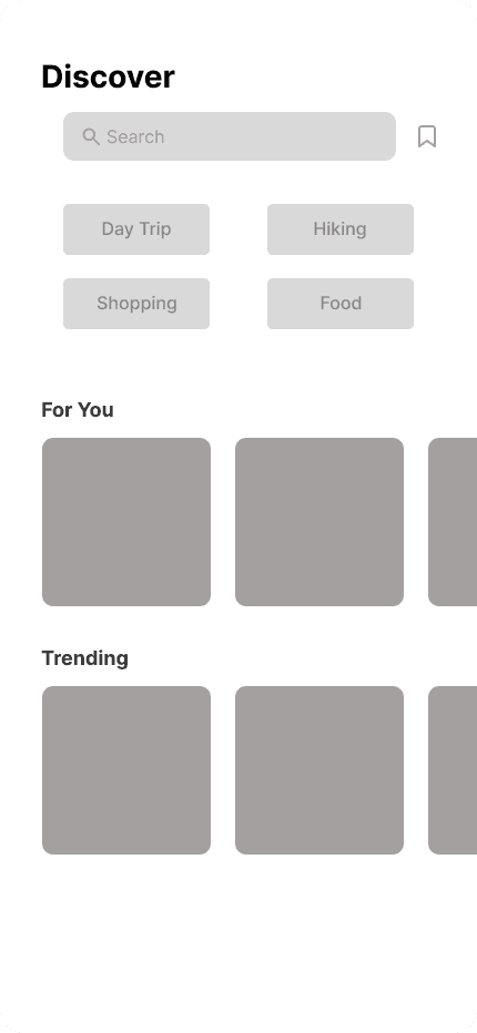
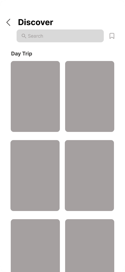
Confused about the positioning of save button
Wondered the difference between “day trip” vs “for you” icons
Curious as to where discover content was coming from
Messaging and Notifications
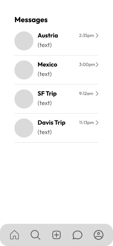

Appreciated a messaging feature to communicate with other attendees
Mentioned that messaging might not be helpful as they don’t plan trips often
